Understanding the Basics of Responsive Web Design: Key Principles and Practices
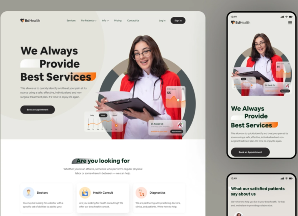
Responsive web design is a crucial approach in modern web development that ensures a seamless user experience across various devices, including desktops, tablets, and smartphones. The core principle of responsive design is to create flexible layouts that adapt fluidly to different screen sizes and orientations. It utilizes techniques such as fluid grids, flexible images, and media queries to adjust the styling within the CSS based on the user's device. This approach not only enhances usability but also positively impacts SEO performance, as search engines prioritize sites that provide a great experience regardless of device.
To effectively implement responsive web design, there are key practices to consider. Begin by employing a mobile-first strategy, which means designing for the smallest screens first and progressively enhancing the experience as the screen size increases. Incorporate media queries to apply different styles based on device characteristics, ensuring that text is readable and images are appropriately resized. Furthermore, leverage flexbox and CSS Grid for layout structure, allowing for greater control and adaptability. By following these principles, web designers can create sites that are not only visually appealing but also functional and accessible to all users.
Top 10 Tools for Creating Seamless Responsive Websites
Creating a responsive website that looks great on any device is crucial in today's digital landscape. Fortunately, there are numerous tools available that can help streamline this process. Here are the Top 10 Tools for Creating Seamless Responsive Websites that every web designer should consider:
- Bootstrap
- Foundation
- WordPress with responsive themes
- Adobe XD
- Figma
- Sketch
- Webflow
- Google Mobile-Friendly Test
- Responsive Design Checker
- Viewport Resizer
Each of these tools offers unique features that cater to different aspects of web design and development. For instance, Bootstrap and Foundation provide pre-designed responsive grids, allowing developers to focus on functionality rather than layout. Meanwhile, design tools like Adobe XD and Figma enable designers to create fluid prototypes that adjust seamlessly across various devices. Employing these responsive design tools not only improves user experience but also enhances your website's SEO performance, making it a win-win for designers and developers alike.
Why Responsive Web Design is Essential for User Experience in 2023
In 2023, responsive web design has become more than just a trend; it is essential for providing an exceptional user experience. With the proliferation of mobile devices, users expect websites to seamlessly adjust to different screen sizes and resolutions. A responsive design ensures that whether a visitor is using a smartphone, tablet, or desktop, they receive a consistent and optimized experience. This adaptability not only enhances usability but also plays a critical role in reducing bounce rates, as users are less likely to leave a site that is difficult to navigate on their device.
Moreover, search engines like Google prioritize mobile-friendly sites in their rankings, meaning that a well-implemented responsive web design not only improves user experience but also enhances your visibility online. By creating a cohesive design that responds to the user's needs, you encourage longer site visits and higher engagement rates. In 2023, neglecting responsive design could mean falling behind competitors who understand the importance of adaptability in a predominantly mobile-first world.