Understanding Color Psychology: How to Choose the Right Palette for Your Website
Understanding color psychology is crucial when it comes to designing a website that resonates with your target audience. Colors evoke emotions and can influence perceptions; choosing the right palette can enhance user experience and drive engagement. For instance, warm colors like red and orange can create a sense of urgency, making them effective for call-to-action buttons, while cooler colors such as blue and green promote tranquility and trust, making them ideal for financial or wellness websites. To dive deeper into the emotional impact of colors, you can refer to Verywell Mind's guide on color psychology.
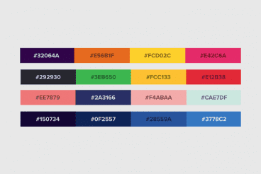
When selecting a color palette, consider the psychological implications of each hue and how they align with your brand identity. A thoughtful approach includes creating a balanced combination of primary, secondary, and accent colors that enhance readability and accessibility. Tools like Adobe Color or Coolors can help in generating harmonious palettes that suit your needs. Additionally, be sure to test your color choices with real users to ensure they evoke the desired feelings. For more insights, check out Smashing Magazine's article on color design in web interfaces.
Top 10 Color Combinations That Will Make Your Website Stand Out
Choosing the right color combinations for your website is crucial in creating a memorable user experience. Certain colors can evoke emotions and set the tone for your brand, making it essential to select the right shades. Here are the top 10 color combinations that will not only grab attention but also enhance your site's aesthetic appeal:
- Blue and White: This classic combination conveys trust and professionalism, making it ideal for corporate websites. Learn more about color psychology to see why this combo works.
- Black and Gold: Luxurious and elegant, black paired with gold is perfect for upscale brands.
- Green and Brown: This earthy palette is great for eco-friendly websites.
- Red and Yellow: Energetic and vibrant, ideal for websites aiming to attract attention.
- Purple and Silver: Conveys creativity and sophistication.
- Teal and Coral: A fresh and modern combination.
- Orange and Navy: This contrast adds a sense of excitement while maintaining professionalism.
- Pink and Grey: Soft yet bold, perfect for fashion and beauty sites.
- Turquoise and Beige: Evokes feelings of tranquility, perfect for wellness-related content.
- Burgundy and Cream: A rich, classy combination that works well for high-end brands.
Is Your Website Color Palette Working Against You? Signs to Look Out For
Choosing the right color palette for your website is crucial, as colors evoke emotions and influence user behavior. If your website's colors clash or don't align with your brand identity, it can create a disjointed user experience. Signs that your color palette might be working against you include a high bounce rate, where visitors leave your site quickly, or low engagement metrics, such as minimal time spent on individual pages. For more insights on color psychology, visit 99designs.
Additionally, if users are struggling to read your site's content due to poor contrast, you might need to reevaluate your color choices. Accessibility is key; colors that are too bright or too dull can deter users, especially those with visual impairments. Consider conducting user testing or utilizing tools to analyze color accessibility. Learn more about accessible color combinations at WebAIM.